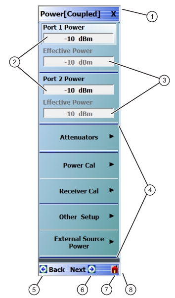
The Main Menu (or MAIN) is the right-side navigation function for the instrument. The Main Menu has multiple types of menus, menu buttons, and menu toolbars that allow the user to configure and control the operation of the VNA. Each menu consists of the elements shown in the figure below.
Menu and Button Components
1. Menu Title – Each menu title is unique.
2. Field Buttons – The button shows the currently selected value. Selecting the button displays a field toolbar.
3. Display Buttons – Read-only calculated display based on parameters entered at other buttons and toolbars.
4. Menu Buttons – Displays a menu or dialog box.
5. Back Button – Returns to a higher-level menu.
6. Next Button – If available, displays a sub-menu that has been already selected.
7. Home Button – Returns to the MAIN menu.
8. Scroll Bar – Not shown in this example, long menus have a right-side scroll bar to display all options.
Menu Title
At the top of the menu, a unique menu title, which is not repeated on any other menu. For space reasons, menu names are often abbreviated. For definitions, see Terms and Abbreviations Glossary.
Menu Buttons
One or more menu buttons that either call a sub-menu, allow for a field value to be specified, toggle a function off or on, or allow a selection to be made from a group of choices. If the menu is longer than one screen, a scroll box and scroll arrows appear on the right side of the menu.
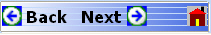
Menu Navigation Buttons
The menu navigation area buttons appear at the bottom of each menu.
Back Button
The Back button returns the menu display to last selected higher-level menu.
Next Button
The Next button returns the menu display to the next deeper sub-menu that has already been selected. The availability of the Back and Next buttons (above) depends on the user’s navigation path. The Home button (below) always appears.
Home Button
The Home button returns the menu display to the MAIN menu.
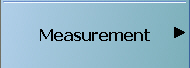
Menu Buttons
Menu buttons call lower-level menus.
For example, the Measurement button on the MAIN menu calls the MEASUREMENT menu. Most button names show the name of the called sub-menu.
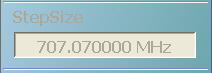
Display Button
Read-only display buttons show system values based on other settings and parameters.
For example, the Step Size display button shows the step size for each point based on a frequency span of 70 GHz using 100 measuring points.
Plain Buttons
Plain buttons start a process or display an operating system dialog box. If they start a process, the button is usually dimmed while the process is running, and when complete, the button is returned to normal brightness.
Toggle Buttons
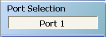
Toggle buttons cycle through two or more values with each click of the button and display their current setting in the button field. For example, in the POWER CALSmenu, the Port Selection button displays an initial setting of Port 1.
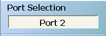
Clicking the Port Selection button selects Port 2.
Clicking the Port Selection button a second time returns the setting to Port 1.
Field Selection Buttons
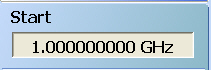
Field selection buttons display a user-defined parameter or value. Clicking a field selection button such as the Start button on the FREQUENCYmenu displays a field toolbar (described below) that allows the user to specify parameter values and units.
Field Toolbars
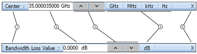
Field toolbars appear under the Icon Toolbar after their field button has been selected. The field toolbar displays its name, a value field, up/down arrows to increment the value, and one or more unit select buttons.
Field Toolbar Selections
1. Toolbar Name – The toolbar name usually is based on the name of the button that called the toolbar.
2. Value Field – Entry area for parameter value. Entry can be from the front panel Number Keys, or from an attached USB keyboard, or by clicking the Up/Down arrows (below).
3. Up/Down Arrows – Increments the value field up or down to quickly enter values. The same effect from the front panel Up/Down Arrow Keys, or from the keyboard Up/Down arrow keys.
4. Available Units Selection – If available (shown in the upper toolbar), allows the selection of units from two or more values. If not available (shown in the lower toolbar), the units are fixed and not selectable.
5. Close X – Closes the toolbar and returns the selected value to the field button that called the toolbar.
For example, clicking the Start button on the FREQUENCY menu displays the Start (Frequency)field toolbar.
Some field toolbars have units that cannot be changed. For example, clicking the Port 1 Power button on the POWER menu displays the Port 1 Power field toolbar with units fixed as dBm.
The system limits for each toolbar are defined in the System Limits section in the Programming Manual Supplement. The appendix lists the default, minimum allowable, and maximum allowable values and whether the toolbar changes apply on a per-trace, per-channel, or per-system basis.
Button Selection Icon
The button select icon identifies a selected option.
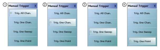
For example, on the MANUAL TRIGGER menu below, the Trig. One Chan. (Trigger One Channel) option has been selected.
After selection, depending on the menu, the user either clicks the Back button navigation icon to return to the prior menu, or once selected, the system auto-returns to the prior menu.
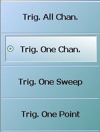
Button selection groups (also called a “radio button group”) allow the user to make one selection from two or more possible options. The selection of any one button de-selects all other buttons in the group. For example, the MANUAL TRIGGER menu is a button selection group with four (4) buttons.
Button Selection Group Example on the MANUAL TRIGGER Menu
After making the selection, use the Back button to return to the previous menu.
1. Trigger All Channels button selected.
2. Trigger One Channel button selected.
3. Trigger One Sweep button selected.
4. Trigger One Point button selected.
After a selection has been made, the button is identified with the selection icon. The user returns to the prior menu by clicking the Back navigation button. In some menus, after a selection is made, the system auto-returns to the previous menu (described below).
Auto-Return Button Groups
Auto-return groups are button selection groups (described above) that automatically return to the higher-level menu after a selection is made.
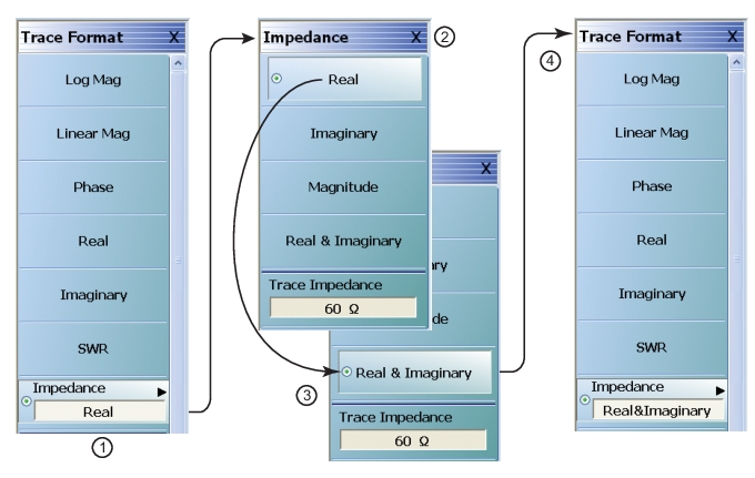
For example, on the TRACE FORMAT menu shown below (1), clicking on the Impedance button displays the IMPEDANCE menu with its current selection of Real (2). When another selection such as Real & Imaginary is made (3), the system auto-returns to the TRACE FORMAT menu with the Impedance button now set to Real & Imaginary (4).
Auto-Return Button Group Example on the IMPEDANCE Menu
1. Original TRACE FORMAT Menu with Impedance setting as “Real”
• The bottom Impedance field button is set to “Real
• Clicking the Impedance button displays the IMPEDANCE menu.
2. Original IMPEDANCE Menu with “Real”
• The IMPEDANCE menu appears with impedance set as “Real.”
3. IMPEDANCE Menu with “Real & Imaginary”
• The user selects “Real & Imaginary” and the system auto-returns to the TRACE FORMAT menu.
4. Modified TRACE FORMAT Menu with Impedance setting as “Real & Imaginary”
• The TRACE FORMAT menu automatically re-appears with impedance set as “Real & Imaginary.”
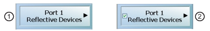
Completion Checkmark Button
In the Calibration menus, some buttons list the required tasks for each calibration type. The completion checkmark icon indicates that a calibration task has been completed.
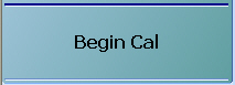
For example, in a Full 2 Port Reflection Calibration, one of the required steps is a Port 1 Short test.
The button above left shows the test has not been started. The user makes the necessary physical connections between the VNA and the required connector/adapter, and then clicks the button to begin the test. The button dims while the test is performed. After the test is successfully completed, the completion icon appears on the left side of the button as shown above right.