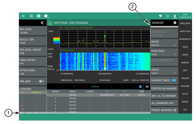
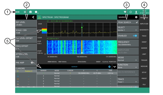
The MS2090A Field Master Pro software controls all instrument functions. The software runs locally on the instrument and primary operation is through the touch screen display. The figure below identifies the main display areas, which are each described in more detail later in this chapter.
GUI Overview (sample display elements)
1. The title bar provides quick access to the system settings and informational dialogs.
2. The status and trace panel is used to show common settings and controls, and to provide trace and cursor information. The information displayed on this panel depends on the current measurement and view settings. Refer to the appropriate chapter in this guide for information about this panel.
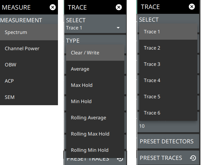
3. Menus are used to configure measurement settings such as frequency, amplitude, and bandwidth, and to enable measurement modes and views such as Spectrogram view, OBW, ACP, and SEM measurements.
4. The main menu provides access to setting menus and other instrument controls.
5. The upper area typically displays graphical data such as spectrum trace and spectrogram plots. The lower area typically displays tabular measurement data such as marker data, demodulation results, or other measurement data depending on the selected measurement.
Operating the Touch Screen
Field Master Pro uses common touch gestures to achieve a variety of operations. These include interactions on hot areas by pressing, double pressing (or tapping), dragging, and pinching.
Touch Screen Gestures
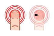
Single Press: Most controls require a single press or tap. Touch the screen briefly and then release.
Double Press: Some controls require a double press or tap. This action is similar to a double mouse click. If a second press is not detected in a certain time period, the action is dismissed or considered a single press.
Press and Drag: Some items can be dragged to a new location. This action is accomplished by pressing and holding the item lightly while dragging it to a new location, then releasing. You can drag items such as markers, limit line nodes, and the center frequency by dragging the trace to the left or right.
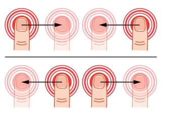
Pinch: Some items can be reduced or expanded. This action is accomplished by simultaneously pressing the item with two fingers and holding the item lightly when dragging the fingers in closer together or out farther apart, and then releasing. You can pinch items in or out, such as the frequency span by touching and holding the trace in two positions, and then dragging your fingers closer together to narrow the span or dragging your fingers farther apart to widen the span.
Common GUI Controls
In addition to the touch gestures described in the previous section, the following lists the most common controls that you will encounter when working with the Field Master Pro.
Common GUI Controls
The 3-line icon provides quick access to system information, settings, file management, and built-in diagnostic tools. Refer to System Menu.
The 9-dot icon provides access for selecting the analyzers. Refer to Selecting the Analyzer.
The camera icon will capture a screen image and save it to a file. Refer to Screenshot Setup.
The USB eject icon is displayed when the instrument detects one or more USB devices. Pressing this icon ejects the USB device, or presents a dialog to select which USB device to eject when more than one device is detected.
The software update icon is displayed when the instrument detects a valid software package. Pressing this icon opens an updated dialog to select the software to install. Refer to Software Update.
The local hose icon is displayed only on the MS2090A PC application when connected to the localhost instead of an instrument. The icon is not functional. Refer to MS2090A PC Software.
The wireless networking icon shows connection status (no connection, weak connection, strong connection) and relative signal strength. Pressing the icon opens the Wi-Fi settings menu. Refer to Wi-Fi Settings.
The GPS icon shows connection status (no connection, no fix, good fix, using last good fix). Pressing the icon opens the GPS/GNSS settings menu. Refer to GPS/GNSS Settings (Option 31).
The battery icon shows the current battery charge state and indicates that the battery is charging with a lightning bolt. A question mark (?) indicates that the battery is not installed or has a malfunction. Touching the icon opens the battery information dialog. Refer to Battery Information.
The close icon is used to close menus and other dialogs.
The chevron will expand and collapse the status and table displays. A similar chevron on the virtual keyboard may be for capital letters or to scroll through key sets.
Toggle icon will enable and disable the feature. When highlighted in blue, the item is enabled.
The drop-down icon exposes a list of items from which to choose.
The refresh icon will restart a process, such as a sweep or averaging count.
The edit icon allows editing of a feature or label.
The enter icon accepts an entry. A similar icon is found on menu buttons to indicate an additional menu.
Gesture lock and unlock icons indicate when the drag and pinch gestures have been toggled on or off. Refer to GESTURES Menu.
Data Entry
User input can be in the form of numeric values for instrument or measurement settings, selected values from a preset list, or alphanumeric text when entering file names, for example. To view or change a parameter value, access the appropriate menu or control, then enter data using the data entry control or attached physical keyboard. Some items can be accessed directly on the annotated display by touching their value.
Invalid Entries
When setting parameters or entering other types of data, if an entry is out of range or is otherwise invalid, Field Master Pro will shade the background display and may provide a message indicating a valid range. In this case, clear or cancel the entry and enter a valid value or change the units by using either the drop-down selection next to the data entry window, or with the unit terminators to the left of the keypad.
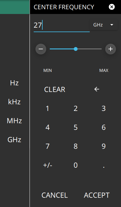
Numeric Values
To modify a numeric parameter setting that is displayed on a menu or annotated field, press the item to make it active and to display the numeric keypad data entry control. Use the touch screen to enter or change the value.
Touchscreen Keypads
The keypad typically provides controls to:
• Enter new values directly, such as frequency entries in Hz, kHz, MHz, or GHz. There are two places on the keypad to enter unit terminators when applicable, on left side pop-out that occurs as frequency keypad entries are selected, or on the top right corner drop-down of the entry field.
• Drag a parameter value within its settable range using a sliding control.
• Increment the parameter value up or down. At each end of the slider are plus (+) and minus (–) controls that increment the parameter value. Most parameters have a fixed increment, such as bandwidth that follows a 1:3:10 sequence and span that follows a 1:2:5:10 sequence. In the case of frequency, you can set a custom frequency step increment value. Once the entry is complete, press the desired unit or press ACCEPT to complete the entry.
• Set the parameter to the maximum or minimum possible value.
• CLEAR the entire entry.
• Left arrow to backspace and delete the entry
• CANCEL to terminate any entries made for that particular setting. Note that pressing the "X" to close the keypad is the same as pressing cancel. Pressing CANCEL will restore settings back to the state they were in before the keypad opened, even if changes from the +/- controls are already reflected in the data display.
• ACCEPT to operate with the settings displayed on the keypad.
A physical keyboard connected via USB can also be used to enter values in a similar manner and the keyboard ENTER key used to accept the new value.
Selection Lists
Some parameters and instrument functions are selectable from a list. These list boxes display the available selections and value limits as applicable. Use the touch screen to scroll through the list and select the desired entry.
Touch Screen Keypads
To cancel the selection, touch somewhere else on the display or close the menu.
Scroll Indication
In some cases, menus, status panels, or other lists contain more information than can be displayed in the available area. In these cases, the top or bottom of the panel will have a fade-to-white appearance as shown below. You can scroll the control to move it up or down and expose the hidden information.
Scroll Indication
1. The fade-to-white at the bottom of the status panel and marker table here indicates that there is more information below the display area. The panel can be scrolled by dragging it upward to expose more information.
2. The fade-to-white at the top of the menu here indicates that there is more information above the display area. The menu can be scrolled by dragging it downward to expose the information.
Note
If the display is set to another color theme, the fade effect remains the same but the color may fade to a dark shade.
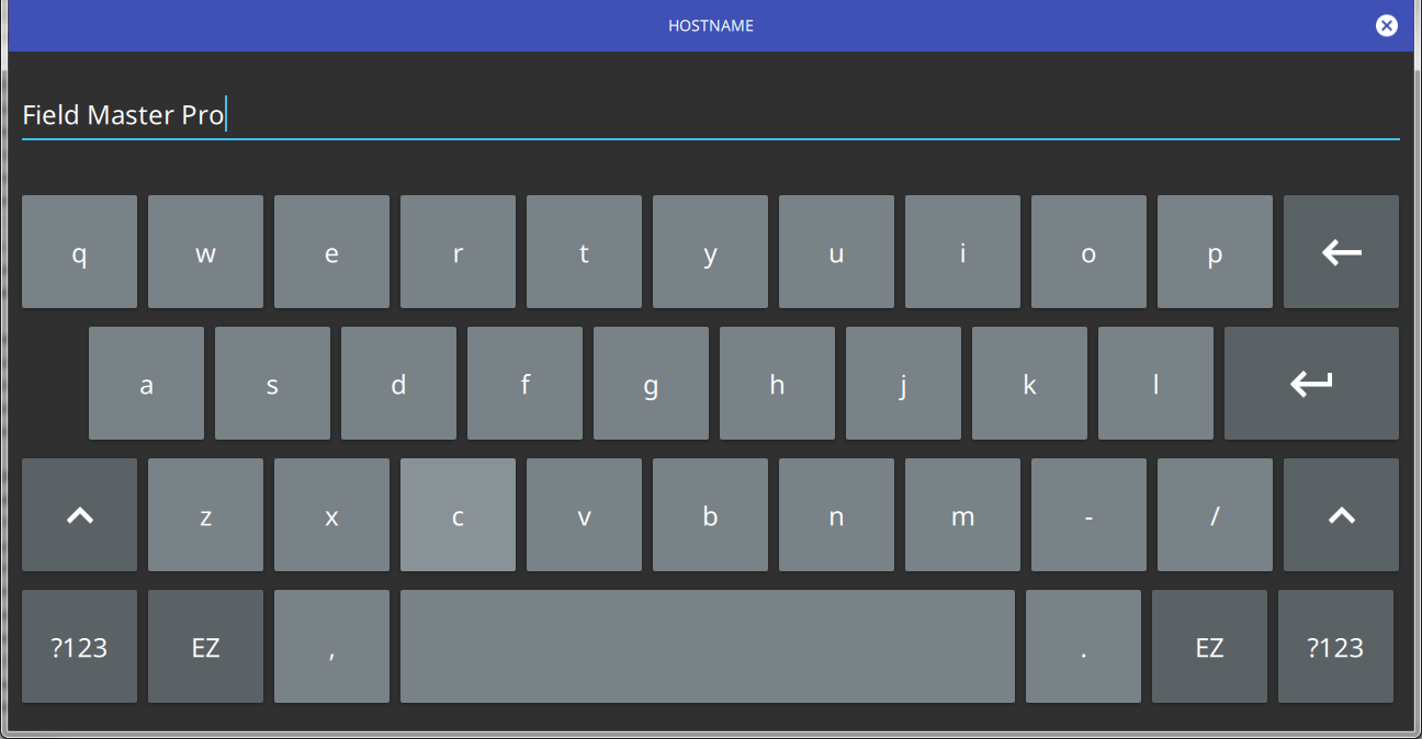
Text Entry and EZ Keyboard
When an instrument function requires you to enter text, such as entering an Ethernet hostname, a touch screen alphabetic keyboard is displayed. See Figure: Touch Screen Keyboard. Press the “?123” key to switch to the digits and symbols keyboard. Use the left arrow key (backspace) to delete the character to the left of the insertion point. The insertion point can be moved to a touched position in the data entry field. You can enable caps lock by double tapping the shift key.
Touch Screen Keyboard
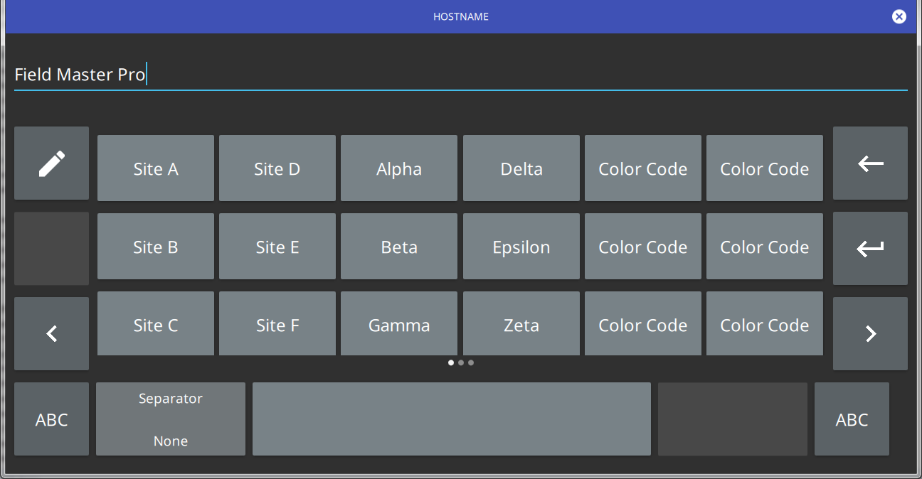
The EZ key switches to a configurable EZ keyboard, illustrated below.
Touch Screen EZ Keyboard
Use the EZ keyboard to enter frequently used text strings with a single screen tap. The EZ keyboard is initially populated with default values. Each key enters the entire string as shown on the key. For convenience, you can set an automatic Separator character to be placed between each EZ key string.
To change a key’s value:
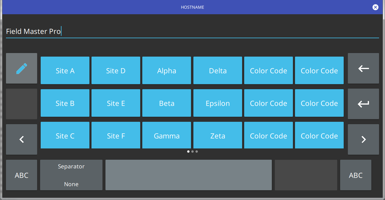
1. Press the pencil (edit) key. The EZ keys will become highlighted.
Touch Screen EZ Keyboard
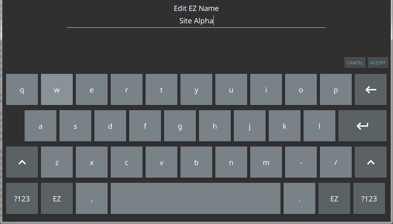
2. Press the key to be edited. This will display the standard keyboard for entering a new EZ key value.
Touch Screen EZ Keyboard
3. Enter the new value, then press ACCEPT to assign the new value to the EZ key, or press CANCEL.

